Introduction
Achieving pixel-perfect layouts while preserving responsiveness in the designs is a challenge that every designer encounters in the area of UI/UX design. The choice of units used to define sizes and measurements is crucial in this effort. In this blog, we'll look at the differences between pixels (px), ems (em), and rems (rem), as well as why these units are important. We'll also look into what is Tailwind CSS config and how the developer tool in Figma can be our best companion in collaboration with developers. Understanding these units not only improves the accuracy of our designs but also promotes a smooth working relationship with developers.
The dilemma of the Emerging Designer
Aspiring designers often struggle with confusing concepts and choices. It's not uncommon for aspiring designers to struggle with finding the proper combination of aesthetics and utility. Inconsistencies in design, a lack of responsiveness, and difficulties in collaborating with developers can all be attributed to a misunderstanding of the measuring units that govern the visual elements.
Why does this knowledge matter?
"Why should we care about pixels, ems, and rems?" A question arises. The truth is that understanding these units allows us to create designs that look great across a wide range of devices, from tiny cellphones to large desktop screens.
What are these units?
Let's dive into understanding the main basic design units which are px, em and rem:
1. Px:
Pixels are the most basic unit of measurement. They are the small building blocks that comprise our screen. A pixel is a single point in a digital image, and in web design, it corresponds to a single dot on a screen. Because they are fixed in size, when we use them, our design will look the same on all displays. However, they do not adapt well to varied screen sizes, making our design appear confined on one device and tiny on another. Px can be difficult to employ for responsive web pages, but they are important for preserving uniform sizing for particular elements. If we have elements that should not be scaled, Px is an excellent solution.
For example: If we specify "Font size = 16px", it will not alter regardless of content or other styles. It will always be 16px, no matter on which display screen we view it on.
2. Em:
Ems are similar to adaptable pals. They modify their size based on the parent element's font size, allowing for relative scaling of elements. Em units are very useful for typography because they automatically adapt based on the user's font size preferences. They're fantastic for keeping proportions in check, but if we're not careful, they can multiply and throw our design off.
For example: Assume, we have a container (as parent element) and we have two content in it , let those content be child element namely "A element" and "B element" respectively. If the parent element has a font size of 16px, then 1em would be equivalent to 16px. And when we specify that "A element has font size 1.5em, that it will be 24" 1.5 times font size of parent element" i.e; 1.5x16 (24px in this case). Similarly, when we will specify that "B element has 0.5 em, it will be 0.5 times font size of parent element" i.e; 0.5x16 (8px in this case).
Note: If we have many parent elements, we need to specify value for each parent element.
3. Rem:
Root Em or rem, units are proportional to the font size of the root (typically the HTML tag) element rather than the font size of the parent element. In contrast to em units, rems provide uniform scale throughout the visual design. This makes "rem" units a preferable choice for maintaining consistency and accuracy in spacing and sizing across a website.
We specify the rem value in the root element (HTML tag). No need to specify value for each container like in em.
Note: the default value for 1 rem is 16px.
For example: If the root font size is 16px and we set font-size: 1.2rem; for an element, the element's font size will always be 1.2 times the root font size. In this case it will be (19.2px)
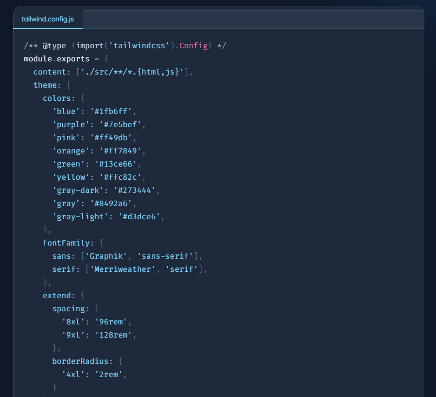
Tailwind CSS Config
In the ever-changing realm of web design and development. Tailwind CSS is a popular style among both developers and designers. It is a highly customizable, utility-first CSS framework that streamlines the process of developing responsive interfaces. It is a collection of pre-made design components that we can customise to our liking. With Tailwind CSS setup, we can build gorgeous and consistent designs without spending hours on difficult CSS coding. Its way of decorating web programmes is gaining popularity among developers. The configuration file, also known as the tailwind.config.js file, is the backbone of this customization.
What is Tailwind Config?
Tailwind config is a JavaScript file that governs various aspects of Tailwind's operation, including our colour palette and theme defaults. Tailwind will look for a tailwind.config.js file in the root of our project to define any changes.
Some examples are:
For more information visit Tailwind config
Why is it useful?
-
Tailwind CSS allows designers to create pixel-perfect designs, while developers can quickly translate those designs into usable websites. It also enables developers to modify the default setup to meet the requirements of their project.
-
The framework may be customised in a variety of ways, including establishing custom colors, fonts, spacing, breakpoints, and more. This amount of customization enables developers to maintain a consistent design language across their whole application or website.
-
Unnecessary classes can be removed, lowering the size of our CSS file and boosting page load speeds. Hence increasing the efficiency.
-
We can define breakpoints and responsive variants for our utility classes in the configuration file. This makes it simple to construct adaptable layouts and adapt our design to different screen widths.
-
It speeds up the development process by enabling rapid prototyping.
Bridging the gap between developer and designer:
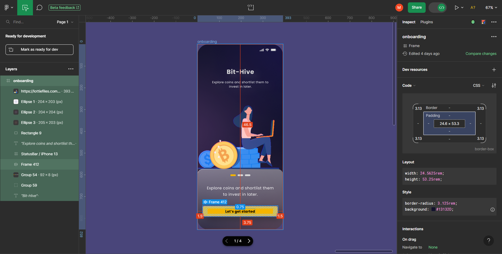
Developer Mode launched by Figma
The gap between design and development has frequently been a challenge for designers and developers. Figma's Developer Mode, a revolutionary feature that promises to transform this collaboration.
Issues Prior to Developer Mode The process of translating designs into code frequently led to misunderstandings and disagreements between designers and developers. The specifications were vague, which resulted in a lengthy back-and-forth.
How it is beneficial? Developers can effortlessly access design details such as CSS properties, dimensions, and assets. It promotes improved communication and alignment among designers and developers. Designer don’t have to put in extra effort and time in providing the dimensions and alignment to developers
In conclusion, knowing how to use CSS units like px, em, and rem is crucial for developing flexible web designs. Tailwind CSS and its configuration provide a comprehensive set of features for designers and developers to efficiently collaborate while retaining design integrity. Figma's Developer Mode has made design-to-code handoffs clearer and more productive, while also eliminating the miscommunication that used to hinder them. We'll be well on our way to being a professional and collaborative web designer if we embrace these tools and concepts. Have fun designing!