Rendering images for Retina or any high DPI screens.
by Vijay,
Authoring HTML and CSS has come a long way. As opposed to the regime built in past, today we focus on lots of thing while authoring a page. We follow the standards and best practices and create semantic HTML with visual properties separated out in CSS.
Here I'll not talk about writing semantic HTML and CSS but will focus on rendering images for latest devices having device pixel ratio of 2(Retina Display), 3(Galaxy S4) and even more in near future. Does it really need to be taken into account? Yes, if you are building a responsive site.
Because the images created for normal display will look pixelated and blurred in these devices.
To understand better, lets look into some basic terms associated with responsive coding.
dpi,Device Pixel Ratio, dip, dppx, are few common units that we should familiarise with.
- dpi - Dots per inch, is way to measure hardware resolution of any device. Which means number of dots per inch. A 21" screen can hev a resolution of 1680 X 1050 and even a 27" can have the same resolution. Larger screen will have less DPI than smaller screen.
- dip - Device independent pixels is actually equivalent to one pixel on 160 dpi screen. Also referred as dp.
- dppx - dots per 'px' unit. This unit uses more than 1 pixel to represent 1 css pixel. For example 2dppx means that it uses 2 pixels to represent 1px in css.
- Device Pixel Ratio (dpr) - This ratio is more of interest as we can switch CSS properties based on this value. This value also determines whether the device display is retina or that of S4.
Device Pixel Ratio = window.devicePixelRatio. IE even 10 doesn't support this. Most of the display have DPR 1 like all non-retinas and windows desktop displays. Retina display has a dpr of 2 which means it has twice more pixel density than a normal display.
Example:
An image of 64px X 64px on dpr 1 display will use 64px wide and 64px vertical screen pixels. whereas on retina it will be rendered by 128px wide and 128px vertical screen pixels. This will make that image look blurry. Will be more disaster on display with dpr 3 (like Galaxy S4)
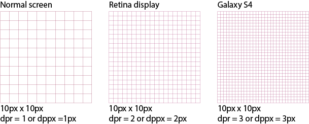
10px by 10px image rendered on different screens.
Coming back, how do we then render images without blurring or pixelating it.
Use svg images
Scalable vector graphics are supported by most browsers. We can create most of the graphics as .svg and use it. Can be even used as sprites. This solves the problem partially as we may not be able to create svg for every graphics especially photographs. In that case we can use media queries.
Above icons are in svg format and it will look perfect in all devices. Check by zooming the page.
Note: svg is not supported below IE9. SVG Web polyfill is available for that.
CSS media queries
For example we have a breakpoint for responsive design at 768px (tablet) and we are displaying a background image for both normal and retina display. As this image cannot be converted to svg we will use media query. Image size is say 250px X 400px and file name is image1.jpg.For retina display we will create the image at 500px X 800px and name is as image1@2x.jpg ans similarly, for device with dpr 3 create the same image at 750px x 1200px and name is as image1@3x.jpg Prefixing with @2x or @3x is just to denote that this image is scaled 2 times or 3 times. Any other consistent prefix works well as long as you decode it correctly.
@media only screen and (min-width: 768px) {
  /* non-retina */
  .image1 {
    background-image: url('image1.jpg');
  }
}

@media only screen and (-webkit-min-device-pixel-ratio: 2) and (min-width: 768px),
  only screen and (min--moz-device-pixel-ratio: 2) and (min-width: 768px),
  only screen and (-o-min-device-pixel-ratio: 2/1) and (min-width: 768px),
  only screen and (min-device-pixel-ratio: 2) and (min-width: 768px),
  only screen and (min-resolution: 2dppx) {
  /* retina display. dpr 2 */
  .image1 {
    background-image: url('image1@2x.jpg');
    background-size: 250px 400px; /* same size as normal image would be or on web it will scale up 2 times */
  }
}

@media only screen and (-webkit-min-device-pixel-ratio: 3) and (min-width: 768px),
  only screen and (min--moz-device-pixel-ratio: 3) and (min-width: 768px),
  only screen and (-o-min-device-pixel-ratio: 3/1) and (min-width: 768px),
  only screen and (min-device-pixel-ratio: 3) and (min-width: 768px),
  only screen and (min-resolution: 3dppx) {
  /* dpr 3 */
  .image1 {
    background-image: url('image1@3x.jpg');
    background-size: 250px 400px; /* same size as normal image would be or on web it will scale up 3 times */
  }
}
Hope you have enjoyed this article, and follow us on twitter
@codemancershq
&bsp;for all the awesome blogs, or you can use rss feeds.