CSS3 Box Model behaviour
by Vijay Sharma,
What is CSS Box Model?
W3C defines "The CSS box model describes the rectangular boxes that are generated for elements in the document tree and laid out according to the visual formatting model"
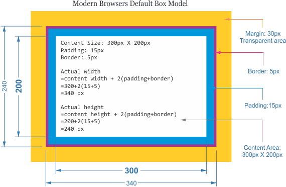
It means that any html element on a web page can be represented using a box. Yes, a web page is full of boxes. These boxes are made up of basically four components which affects their representation on a page. This four components are Content, Padding, Border and Margin. HTML elements represented by a box can have all these four components or at least one component which is Content. Normally a box model can be represented by the following illustration.

- Content - this defines the content area of the box where the actual content like text, images or maybe other elements reside.
- Padding - this clears the main content from its containing box.
- Border - this surrounds both content and padding.
- Margin - this area defines a transparent space that separates it from other elements.
A bit of history
Prior to IE6, internet explorer had its own box model called Internet Explorer box model which was considered a buggy model. As per CSS 1 specifications, any width and height applied to an element via css will apply only to content area. Any padding, border and margin applied are added to the content area. This is how width and height are applied to element boxes. And this still holds true for all browsers. Even CSS3 spec makes this a default way of handling box models. As I mentioned earlier that internet explorer followed its own box model which was considered buggy. Any width and height applied to an element in internet explorer did include only content area, rather it applied to content area including padding and border. So an element normally appeared narrower in IE compared to other browsers. For backwards compatibility IE supported this model in quirks mode. You can trigger quirks mode in IE by using HTML 3 or earlier DTD or by completely removing DTD.
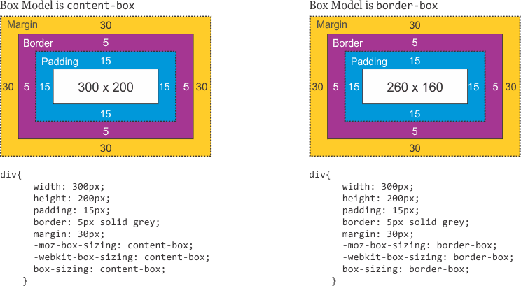
Strangely, over the years we realized that the model considered buggy is actually what web authors need? CSS3 brought back this so called buggy model and now we have two box models which web authors can choose as per their requirement. These two different box models can be triggered via css with property box-sizing with valuescontent-box | border-box | inherit.
Below image shows how two different models behave.

We are happy with what is there by default. Is it useful?
In my opinion, having the flexibility of choosing box-model of your preference has made life much easier when it comes to coding HTML. Major browsers are already supporting it with vendor prefixes like below.
css
div {
  -moz-box-sizing: border-box;
  -webkit-box-sizing: border-box;
  box-sizing: border-box;
}
Example:
Say we need a two column layout. Left column with 40% width and right column with 60% width. With default box model or box-sizing:content-box, we will create two floated divs with 40% and 60% with respectively with out adding any padding or margin, or else it will add to the content width and break the layout. These two divs will act as wrappers for left and right content. Any padding intended will have to applied to inner container div inside each wrapper.
css
.div40,
.div60 {
  float: left;
}

.div40 {
  width: 40%;
}

.div60 {
  width: 60%;
}

/* For Padding */
.div40 > div,
.div60 > div {
  padding: 20px;
}
Using border-box model there's no need for using extra div for padding which will surely take one step ahead in semantic coding. Lets see the code.
css
.div40,
.div60 {
  -moz-box-sizing: border-box;
  -webkit-box-sizing: border-box;
  box-sizing: border-box;
  float: left;
  padding: 20px; //Padding to the same div will be adjusted from the specific width of each div. Same will be true for borders as well.
}

.div40 {
  width: 40%;
}

.div60 {
  width: 60%;
}
This example is just an illustration of CSS Box Model. You are the best judge for the kind of box-model you are going to use in your project.
Hope you have enjoyed this article, and follow us on twitter
@codemancershq
&bsp;for all the awesome blogs, or you can use rss feeds.