Developing a design system, a design developer collabration
by Jawakar Durai and Syed Sibtain,
We think Design Systems are some buzzwords we hear in big companies, where they will put some of the core principles and components they use to put together a page easily without code standards. Sometimes they also open source the system for other people to use or inspire.
"Design Systems are constantly evolving collections of reusable components, principles, and guidelines that provide designers and engineers with a common language for consistent product and web design."
However, large corporations are not the only ones who need to build design systems. We can even accomplish it for a small business or product where only three or four individuals are collaborating.
The design system gives the utmost clarity on how each small component works for both the designer and the developer, and we can easily tweak the component to add or modify the behaviour.
In this blog, we'll look at three major technologies to see how designers and developers can work together to create a simple design element, such as a button, with some variations. We'll also learn how to effectively manage typographic and spacing consistency.
And the tools we will use are as follows:
- Figma - to create button design
- React - to create the buttons
- Storybook - to visualize and interact with the button.
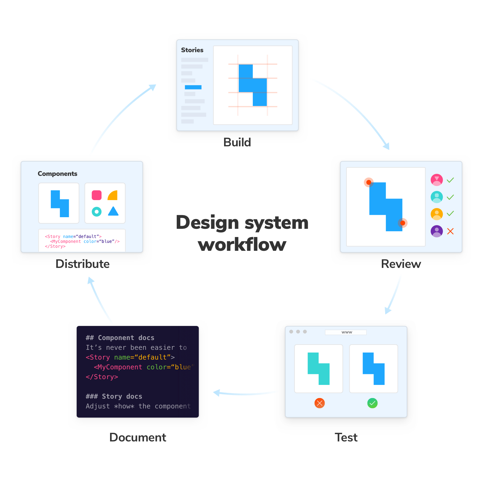
The fundamental steps of building a design system
-
Conduct a Visual Audit :
A visual audit is a multi-step process that must be completed while developing a design system. It is critical to first identify key UI properties such as colours, typography and imagery and then analyse how these properties will be used in the components. Additionally, we may use tools like CSS Stats, which offers analytics and visualisations for your stylesheets.
-
Organise Pages :
Irrespective of the software we choose, like Figma or Adobe XD, we will probably use pages to arrange the library's contents. There are various methods for implementing these design systems. Some people prefer to follow the structures of atoms, molecules, and organisms and some prefer 'Pattern Pages'. And the choice belongs to the people.
-
Develop the typographic scale and colour scheme :
It is necessary to create the groundwork for those components before we begin designing new ones. Establishing our design system's typography early on is one of its most essential aspects. To ensure a consistent information architecture across all products, we must choose the fonts, font weights, line heights, and responsiveness to be used. In addition, when it comes to developing a design system, colours rank first (after typography). Even if our components don't have icons, buttons, or photos, they do always have some colours and text, so choosing the proper tones is crucial. Therefore, we must decide on a colour palette, choose the primary colours, and assign them the appropriate names.
-
Create Component/Pattern Library :
This is the exciting part. We gather all of the functional parts and pieces of our UI that are currently being developed. That includes each button, form, modal, and image. The list is constantly revised, and we evaluate it based on the needs of the project (user needs/business requirements).
-
Documentation :
An important part of a design system is documenting the necessary factors that led to the design of a particular component. The documentation should provide two key explanations:
- when, where and how to use a component.
- behaviors like, size, colors, animation.
These details help to maintain consistency when using a component to create a web application or other product.
Workflow
Building a Design System With Figma, React & Storybook
Figma, React, and Storybook are all great tools. We can create an end-to-end, fully integrated design system using this combination.
The design
Instead of starting from scratch, we can use a template that has already been created and published in the Figma community. https://www.figma.com/community/file/1136902196592165876, click 'Get a copy,' and a new file would be created for you. In figma, the design elements are designed as components. These components can have some settings.
Steps
- Design the UI Component from scratch (Please use the above Figma file to get started).
- Convert the Design to code by implementing the Hero Design in React JS.
- Once we are done with the code, we need to create a storybook for the Design.
- The storybook should include all of the variants supported by Figma, along with controls.
- Raise a pull request.
- The designer should approve the storybook for the changes.
- Iterate on the designer's feedback on both functionality and view.
To avoid confusion, we should try to keep the names of the variants and custom properties similar to the names of the react component props.
We must also connect Figma and Storybook. Once we have the integration on both sides, it's easy for both designer and developer to sync and check with the new changes.
We really depend so much on building the app just to check layouts, and layouts also create a starting point for creating a storybook. Once done, the designer or QA can check the layout design. This will reduce the time, if our build takes a longer time due to fewer concurrent builds or slower build speeds. Also, if a non-content bug is reported, we can recreate it in the layout and fix it on the go.
Maintaining a design system can be expensive at first, but it is still cost-effective when compared to the bugs and issues that arise when there is no separation. And we can bring designers and developers together on one unified platform through tools built to bridge this gap from both the design and development ends.
Setting up StoryBook
First and foremost, what exactly is a story?
"A story captures the rendered state of a UI component. We as Developers write multiple stories per component that describe all the “interesting” states a component can support."
We start with writing the code for the component and then move on to the storybook (available for React, Vue, Web Components, Angular). We can add a storybook to our existing React app by simply using the below command.
// Add Storybook:
npx storybook init
And now since we are working on a Hero Component, let's create one.
// Hero.stories.jsx

import React from 'react';

<Hero
  imgAlt="Hero Alt Txt"
  imgSrc="https://via.placeholder.com/1200x650"
>
  <React.Fragment key=".0">
    <Heading tagName="h1">
      Hero title
    </Heading>
    <TextPassage className="sparky-u-margin-top-lg">
      This is the hero description
    </TextPassage>
  </React.Fragment>
</Hero>
And finally we can run it using the below command.
npm run storybook
Once we set up a Storybook, we can allow teammates to view and test components separately.
What's even better, we can invite designers to Storybook to take part in QA and collaborate on the required corrections.
Setting up Controls
We can go even one step further and handover some control to the designer using StoryBook Controls. With the help of Storybook Controls, we may interact graphically and automatically with a component's parameters. It adds a panel to our component examples (or "stories") so we may update them in real time.
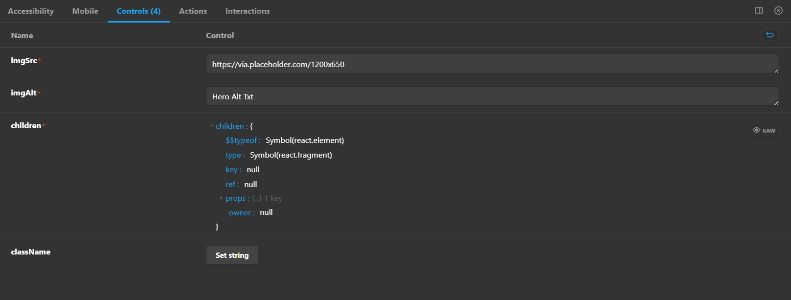
We can use Storybook to replicate any changes to the component's Args and invite designers to perform QA. We can also update the repository, and the changes will be automatically synced with Figma. And the process continues.
The Summary
A Design System's robust documentation is what sets it apart from a component library. Furthermore, the most successful design systems include excellent documentation. And throughout the entire process, it's critical to communicate with engineers, product managers, and other stakeholders.
Building a design system takes time, preparation, and dedication. It also presents an ongoing challenge as the design system must be updated and modified to better meet the requirements of the organization. Although it might initially seem difficult, tackling it little by little will make it much more practical.